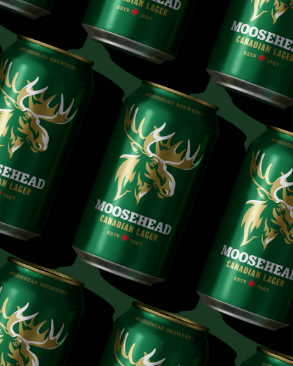
The Moosehead Rebrand Story
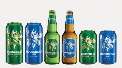
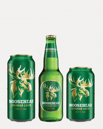
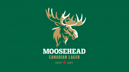
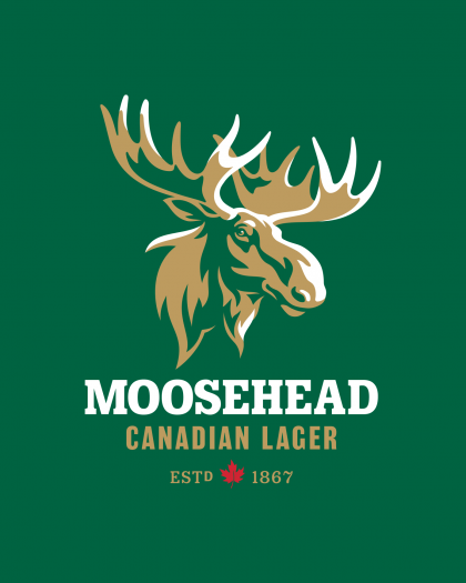
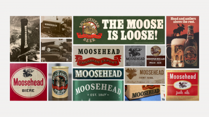
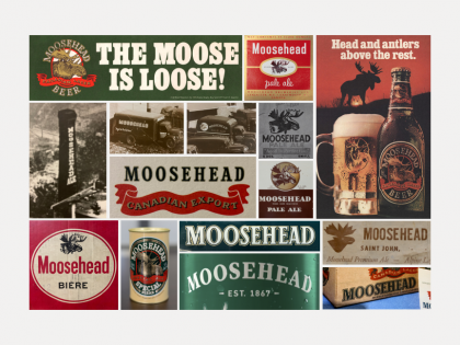
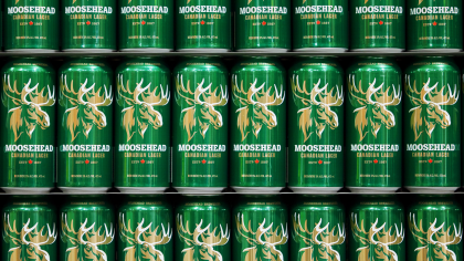
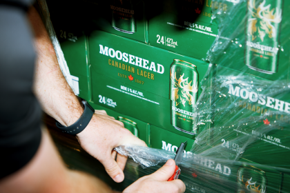
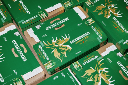
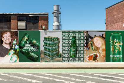
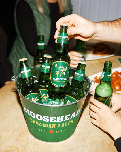
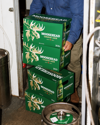
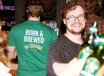
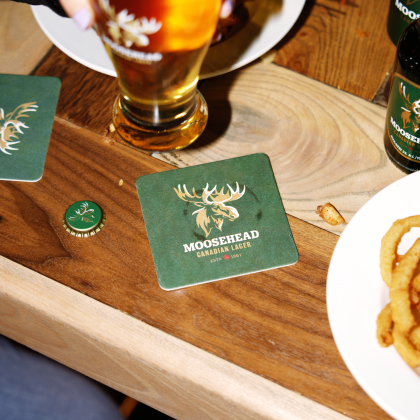
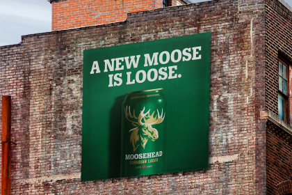
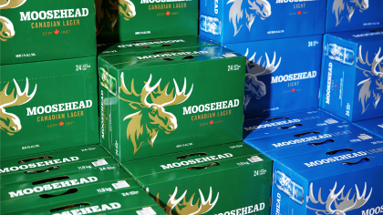
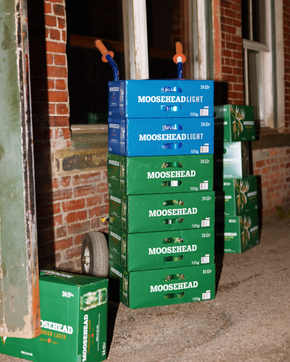
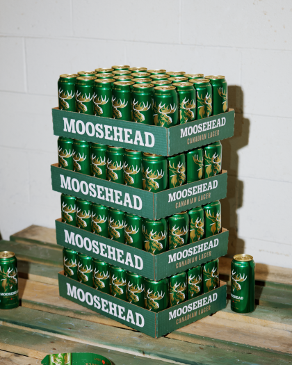
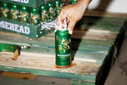
Moosehead Lager is one of Canada’s most storied and beloved beers. For decades the brand was known to Canadians as the domestic beer in the green import-style bottle, which set them apart from their brown-glass competitors. To return Moosehead to its premium roots, and modernise the brand without losing its soul, we evolved the brand by building off the elements from its original packaging design dating back to 1978 - the look that made them so iconic to Canadian beer drinkers for decades. We started by redrawing the brand’s most significant asset, the moose, to make it even more reflective of the brand’s courageous spirit and to increase a sense of connection between the animal and the drinker. We then restructured the packaging hierarchy to bring greater emphasis to the beer's majestic namesake and reintroduced a strong use of gold as well as a richer, more vibrant emerald green. The result is a renewed brand identity that combines historical typographic references with a modern sensibility to appeal to both new and old Moosehead drinkers - ensuring the brand's longevity, legacy, and strong shelf presence for years to come.